

Lanzarote
International Cup
Branding
Graphic Design
Creative Direction
The Lanzarote International Cup is a prestigious football tournament that brings together the best national and international teams, with the island of Lanzarote as its unique and captivating stadium. The event’s goal was to create a brand that reflects the competitive spirit, international prestige, and camaraderie of the tournament, while also showcasing the island's natural beauty and passion for the sport.
Visit the website →
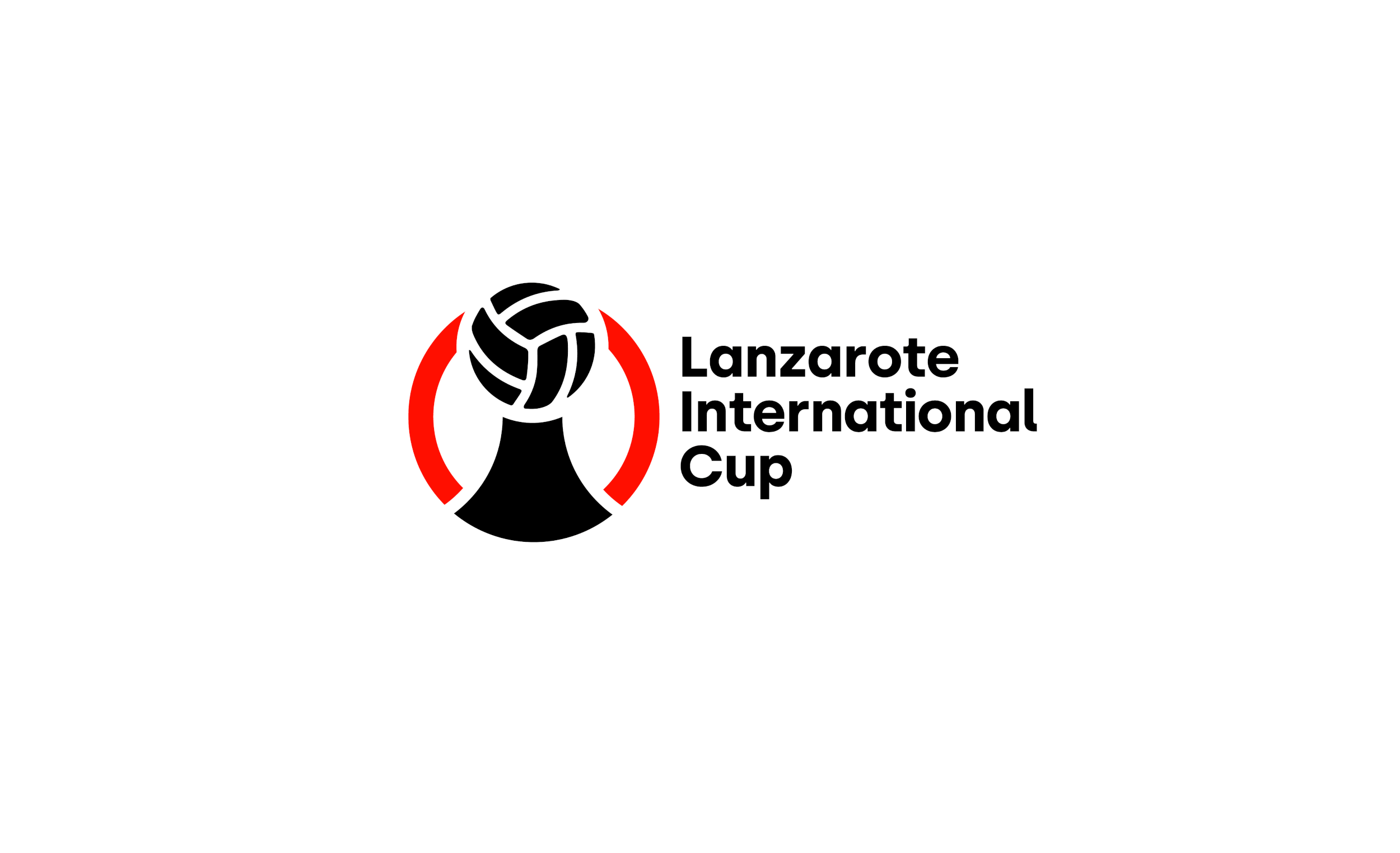
The graphic symbol represents the body of a child, symbolizing the future and vitality of the sport. The head is a vintage football, reflecting the rich history of football on the island of Lanzarote. The torso of the figure is shaped like a volcano, representing the island’s volcanic landscape and reinforcing the connection between the tournament and Lanzarote’s unique natural heritage


The typography chosen for the project includes Ostwald for headlines and Poppins for body copy. These fonts were selected to create impactful yet friendly messaging, while also allowing for the development of longer copy materials without compromising readability.


The brand didn’t just exist in promotional materials, social media, and digital spaces—it also came to life at the event itself. The visual identity played a crucial role in elevating the overall experience for both participants and spectators, leaving a lasting impact on the atmosphere and making the tournament even more memorable.


